Dan Friedman
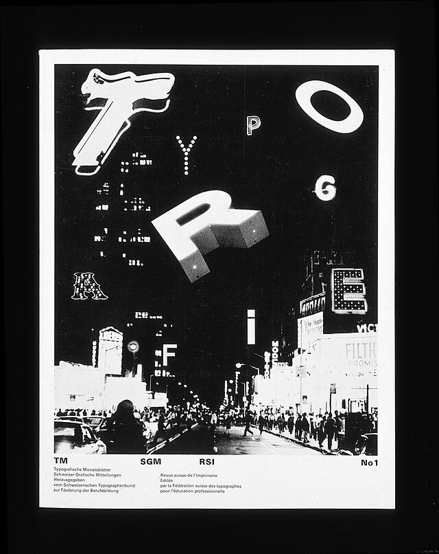
An article on Theory and Typography
An article on Theory and Typography
The most encouraging recent phenomena in graphic design have been the accelerated development of complex discourse, the increasing attention to historical research and social objectives, and the frequently heated debate. No area seems more contentious than typography, which has been propelled into a new age by an extraordinary digital technology. The conflicts are largely generational, and the battles are often fought on moral grounds. For example, the older generation tends to find the greatest freedom working within restraint; the newer generation sees restraints as outmoded limitations. One group sees simplification as the route toward a more universal communication and feels a moral obligation to overcome pervasive visual pollution; the other sees simplification as an immoral act of exclusion and a form of cultural sanitization that impedes more diverse, complex, or personal expression.
This is the stuff of great debate. It reminds me of a period twenty-five years ago when we began to foster a new typography, even though our audience was much smaller. (At the time, the American Institute of Graphic Arts has about the same number of members nationally as it has today in New York City alone.) That period was also driven by technological change—the transformation from metal typesetting, often done by hand, to computer-driven photo typesetting. Schools were caught in the middle: most maintained a typesetting and letterpress printing technology that was fast disappearing, while looking ahead to a new technology for which they could not afford the equipment and materials. Furthermore, schools faced a pedagogical dilemma. Most of the terminology and the criteria for quality were inherent within metal typesetting and a history that began with Gutenberg. Even the early modernist idioms of typography had been viewed as natural to letterpress technology. With the advent of photo typesetting, techniques that had existed for some five hundred years suddenly lost their foundation. The terminology was the same (leading, font, point size, and so on), but the technology no longer provided a reliable base for determining line space, letter spacing, letter proportion, size, and almost everything else considered standards. Anything could be viewed as natural to the new technology—a preview to the digital typesetting revolution that began in the 1980’s.
Typography is central to but surely not always the dominant aspect of graphic design. Although many have made it a specialization, I chose this direction only as a teacher during the transitional time of the late 1960’s and early 1970’s. What beginning students needed then (and still need now) was a reconceived methodology for understanding typography. It would be predicted on the principles of drawing, basic design, and new critical theories and less on the anachronisms of a rapid changing history and technology. The methodology would be seen as a foundation of, not as a replacement for, personal expression.
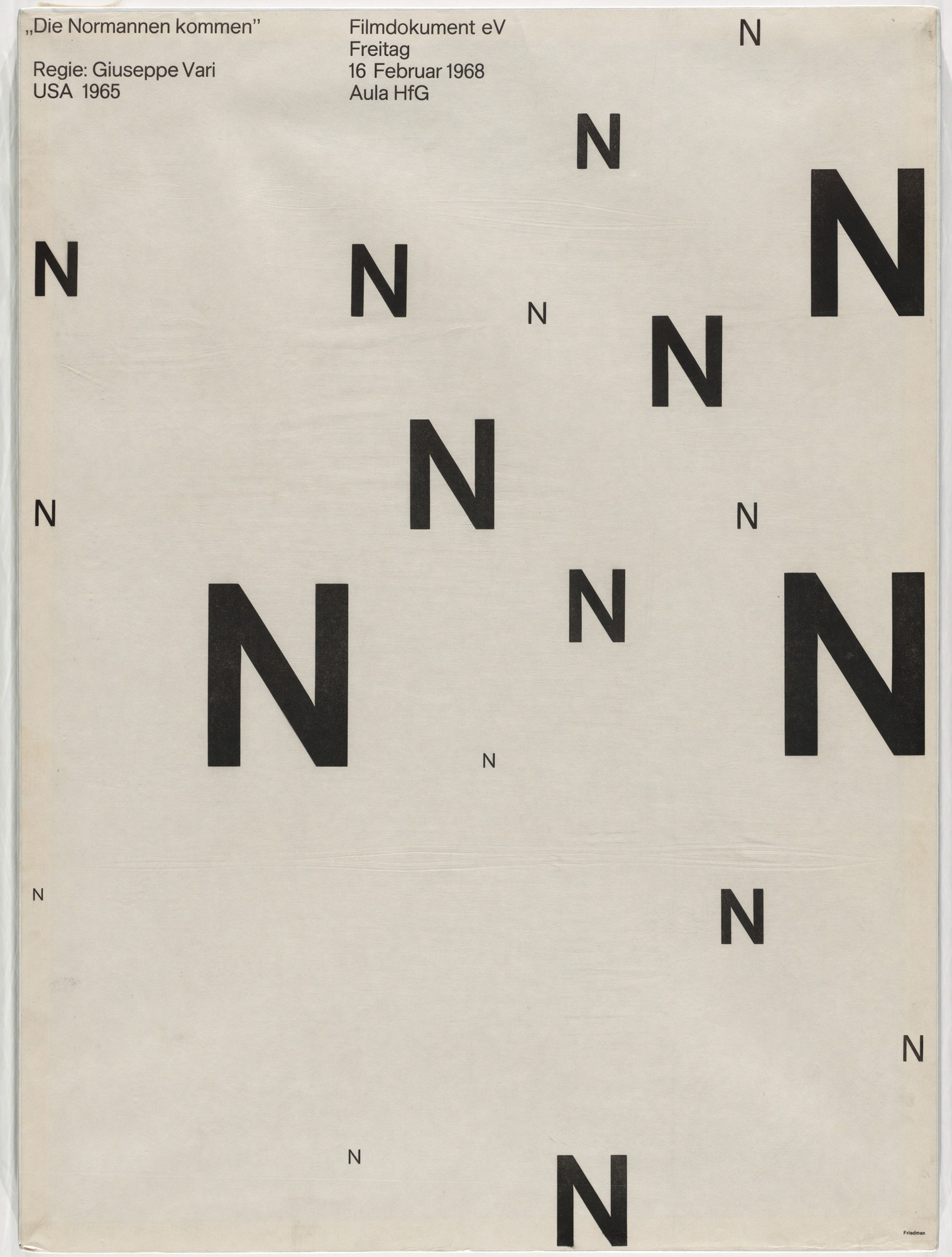
My student often began typographic exercises with experiments in making messages dysfunctional. By studying progressive degrees of illegibility, we were able to establish acceptable tolerance levels. The methods of destroying messages I associated with “noise,” a term borrowed from information theory to refer to disturbances in the communication process which guarantee that messages sent can never correlate exactly with messages received. This was an early attempt to relate ideas emanating from linguistic and literary theory to the study of typography, an association that has evolved today to the point where some designers now use poststructuralism as a source of inspiration. (It should be noted that the results of such inspirations can be unpredictable, but they are not always of scientific, aesthetic, or practical value.)

This characteristic in typography requires the reader to be an active recipient and is more dependent on the receiver than on the sender to formulate the message. Unpredictability promotes interest, pleasure, and challenge in reading. It implies that the design/text is open-ended, fractured, and ambiguous, which means that a reader can create his or her won multiple interpretations. Because the reader is confronted daily with so much (legible) information from which to choose, it may be the characteristics of unpredictability that will entice the reader in the first place. (The opposite could also hold true as the characteristics of unpredictability eventually become conventional.) These early experiments with their progressive degrees of fracturing messages preceded by many years the functionalism-versus-antifunctionalism arguments that continue to prevail today.

It is risky to concentrate typographic investigation at either end of this legibility/unpredictability spectrum. For those concerned primarily with legibility (conventional functionalism), the creative potential of seeing from an entirely different perspective will be unexplored. For those primarily interested in unpredictability (considered by some to be characteristic of postmodernism), there are potentially greater risks. (I say “greater” because I tend to have a special sympathy for the natural predicament faced by those who opt for the radically unconventional.) First, overspecialization in an extreme, experimental typography can marginalize designers by enabling them to avoid the more complex problems of graphic design. For example, the typographic identification on medical equipment of highway signage would not appropriately lend itself to multiple interpretations by the reader. Second, visual experiments with layering, deconstructing, and manipulating are often verbally rationalized as expressions of our contemporary milieu, even though others interpret them simply as more garbage in the worldwide glut of indigestible information. Third, experiments with unpredictability have come to depend on a common set of idiomatic elements which carry their own visual and linguistic codes and operate within a rather closed network of converted readers and believers. Extended further, this suggests that each form of unpredictability can become one more stylistic trend which is eventually appropriated by the market at increasingly accelerated speed. It may reach a larger audience but in the process may be stripped of its meaning (in the manner of the formalistic New Wave or nearly defunct Postmodern styles).
Radical Modernism acknowledges our existing culture, conventions, and history contrasted with the creative spirit to question and reconceptualize. In relation to typography, radical modernism includes the full spectrum from legibility to unpredictably. New theories regarding typography should acknowledge the potential of this entire spectrum rather than take sides on one end or the other. There are now glimmers of hope that polarization will fade between these entrenched generational positions and between those who design with typography derived from either traditional or digital techniques. The most encouraging development is that what were lonely conversations twenty-five years ago are now part of a lively discourse among designers in many countries.