cup o'kitty Visual Identity
Below you could see the description of this project by my student, Jules Medlin.
hi! I’m Jules and I am an aspiring graphic designer and student at Florida Atlantic University.
The following pages showcase my logo design journey for a fictitious cat café & shelter company I created for this project as part of my graphic
design studies.
Student: Jules Medlin
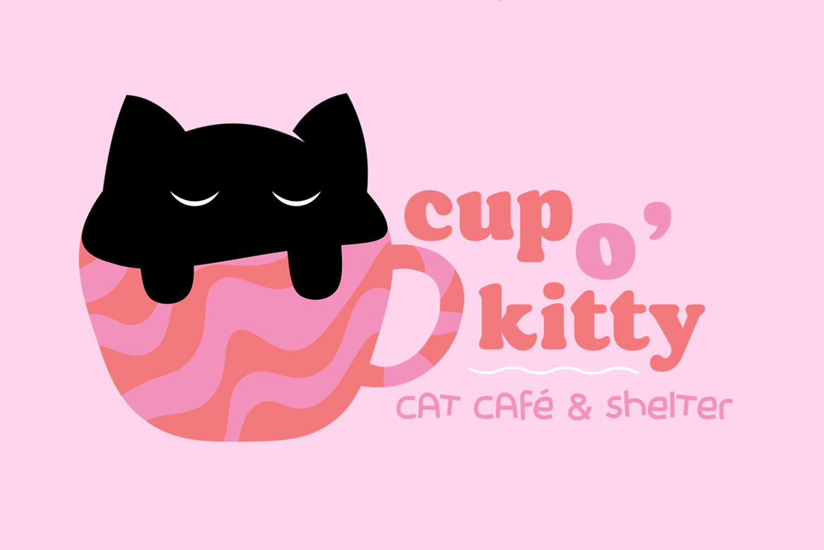
cup o'kitty is a cat café and shelter, a fictitious company created for the purposes of this logo design project.
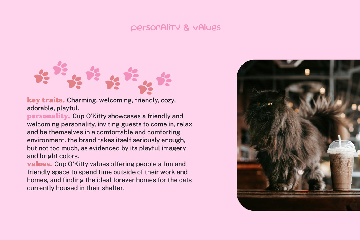
target audience: young adults in their 20s and 30s who enjoy cafés and cats, especially those interested in adopting a cat.
mission: to provide a special café experience in the company of cats that are available for adoption. In addition, the company aims to find forever homes for the cats in their shelter.
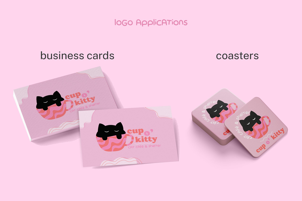
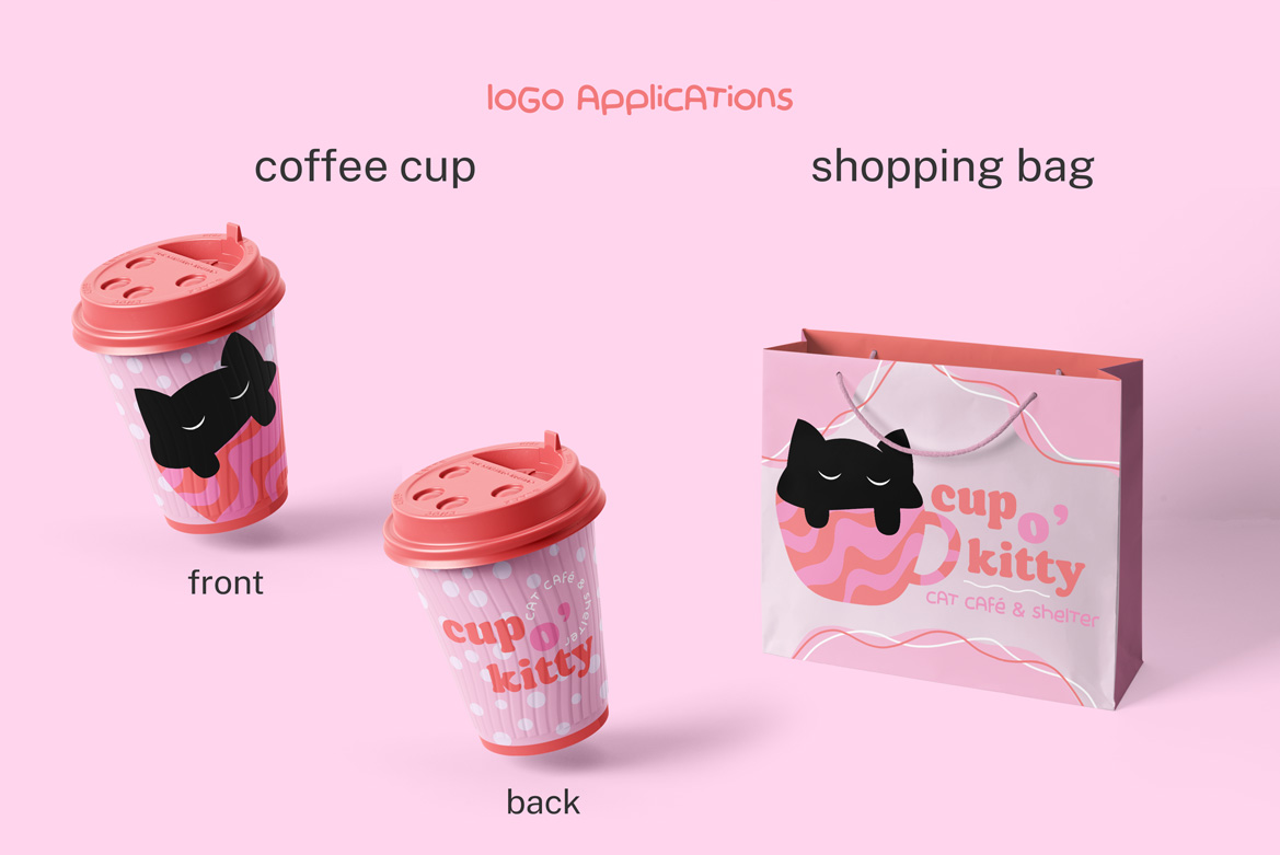
advantages: currently, cat cafés are a growing trend, sparking interest in many young adults with an affinity for cats who are looking for a third space outside of their work and home to spend time in and socialize.
color palette: this brand utilitizes a simple
color palette consisting of
pink and orange as it’s main
colors, inspired by the
sunset, and black and white
for accents.
pink and orange work well in
harmony together and help
to convey adorableness and
charm.
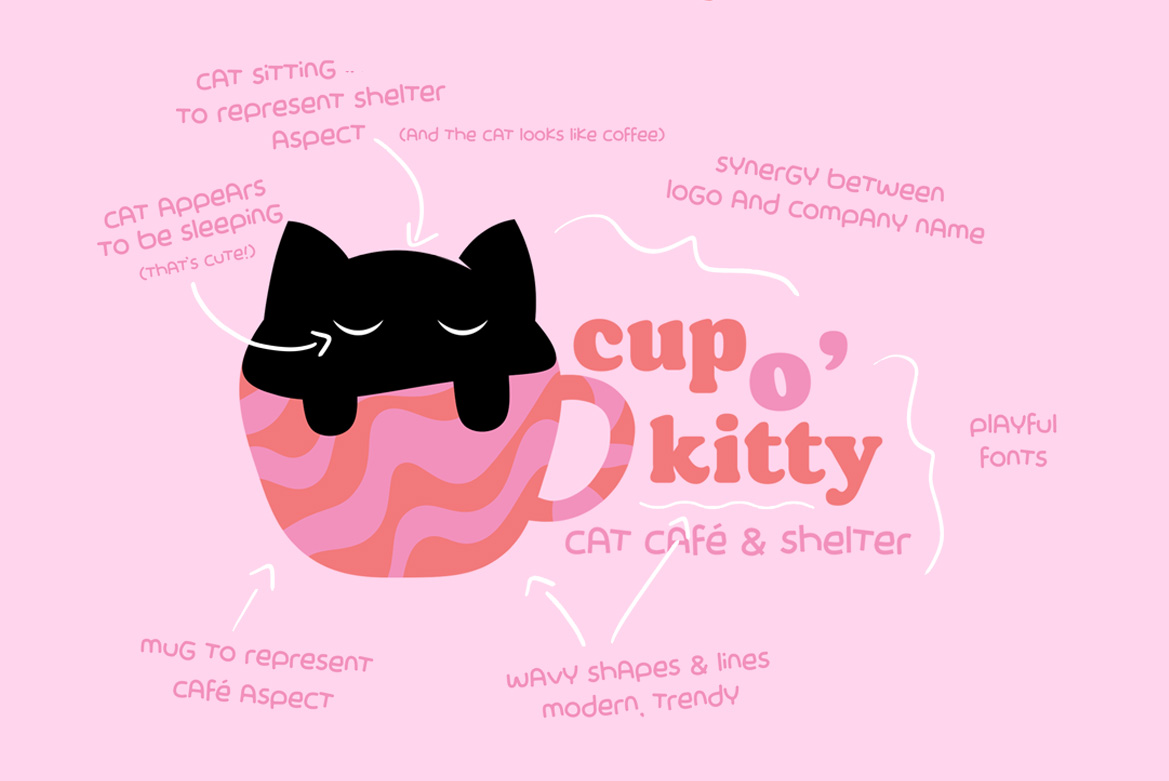
shapes: soft, rounded shapes and
wavy lines were used in this
logo as they are the kinds of
shapes that best represent
the feeling of a cozy cat
café that wants to make
people feel welcome and
comfortable
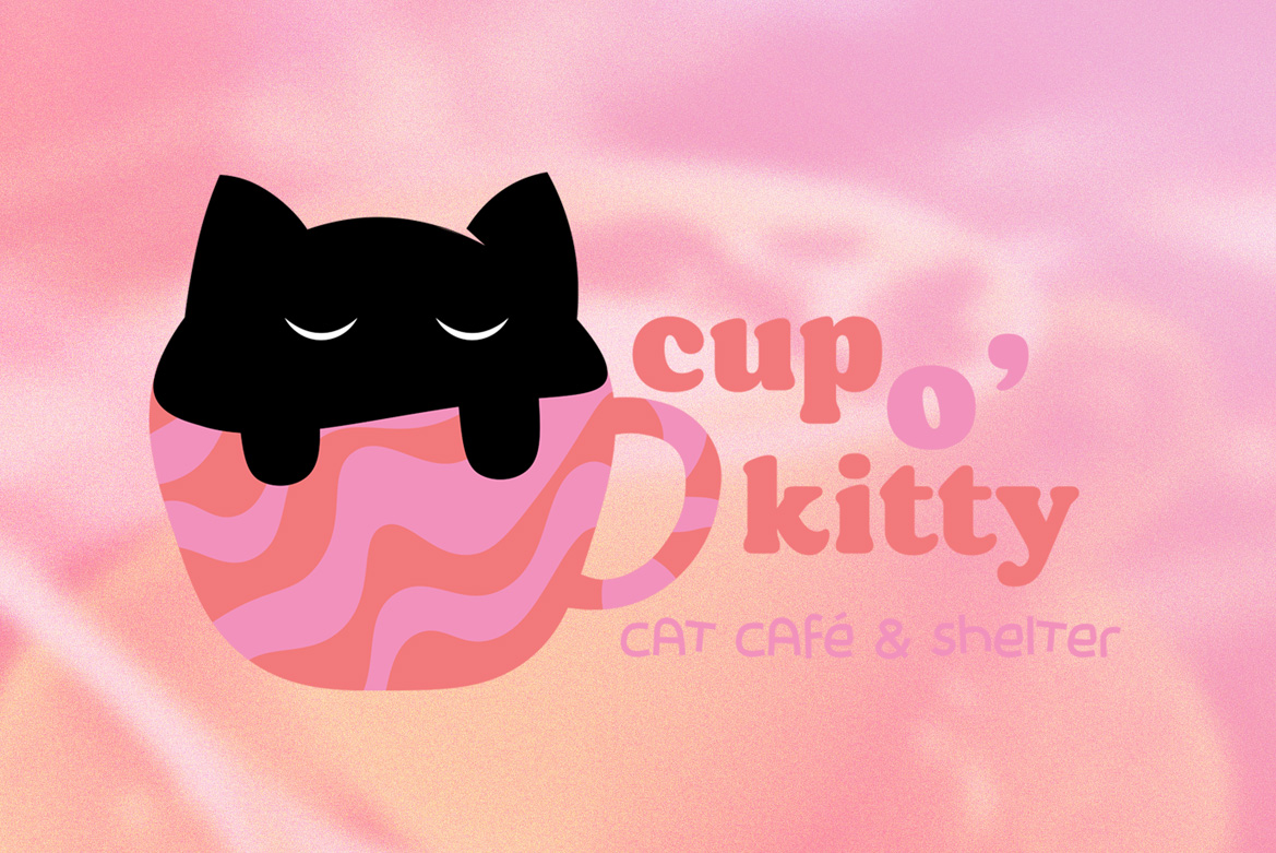
fonts: I picked the fonts donut shop and bake bunny for the brand name and slogan respectively. donut shop is the primary font meant to draw in the viewer with its bold characters and rounded serifs. bake bunny is the accent font and used in a smaller point than donut shop. the characters are also made up of rounded shapes, and it is a very playful, sans serif font that provides much needed contrasts to donut shop. despite both being stylistic fonts, they end up working well together as there is enough contrast and they are not fighting for the spotlight.