
I take a hands-on approach to every aspect of my web and email projects, from art direction and design to prototyping and coding. For websites, I implement responsive coding techniques using HTML, CSS, and JavaScript, ensuring that each site adapts seamlessly to different devices and platforms. This involves creating fluid layouts and incorporating media queries to optimize the user experience across desktops, tablets, and smartphones. Explore my collection showcasing the most recent website and email designs and coding below.

↑ fauwebdesign.com includes the collections of amazing works that my students were creating with me during my IDL2, Interactive Design Lab 2, class with them. I am so proud of you guys! I used responsive coding with hand-coding of HTML, CSS and JavaScript for this website.
Responsive web design is essential in modern web development, allowing websites and applications to be accessed seamlessly across various devices and screen sizes. This adaptability is achieved through flexible layouts and media queries that enable the content and design to adjust based on the user's device.
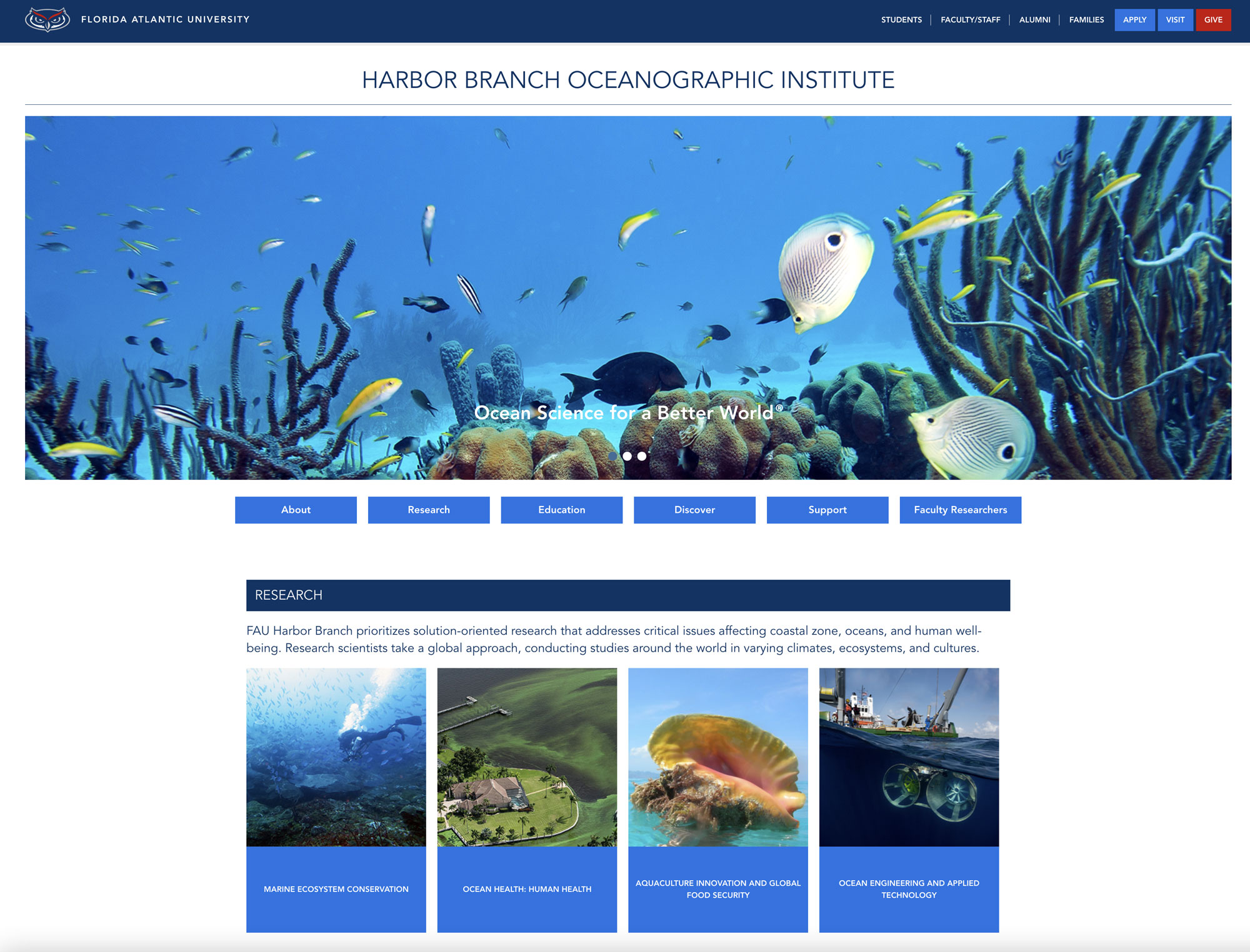
↑ Website for the FAU Harbor Branch Oceanographic Institute
By prioritizing responsiveness, developers ensure that users have a consistent and optimized browsing experience, whether they are accessing the site from a desktop computer, tablet, or smartphone. This approach not only enhances accessibility but also improves user engagement and satisfaction by providing a visually appealing and user-friendly interface regardless of the device being used.


↑ This website coding for the Infinity Sales Group uses an older technique that doesn't allow the website to be responsive on various display sizes. Instead, it maintains its rigid structure on any device. I’ve kept this website's coding here as a small demo to showcase the stages of web design and coding development.
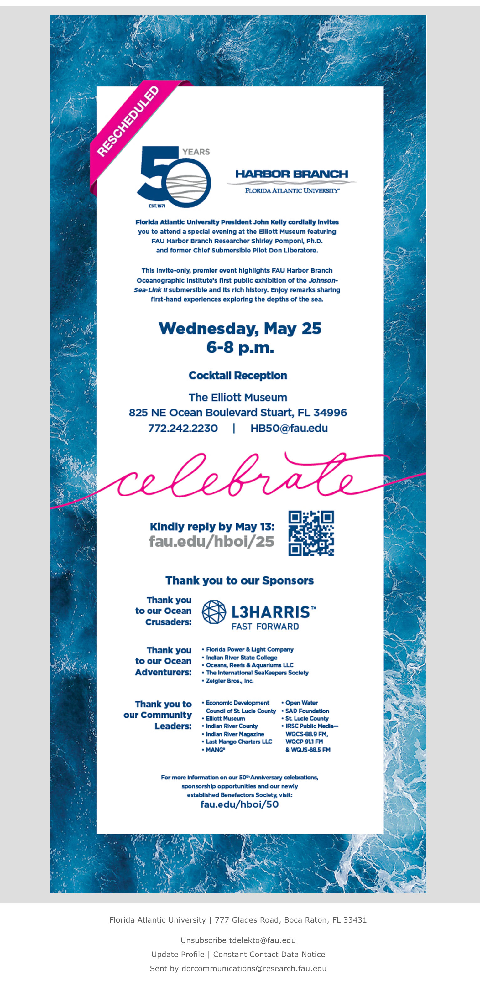
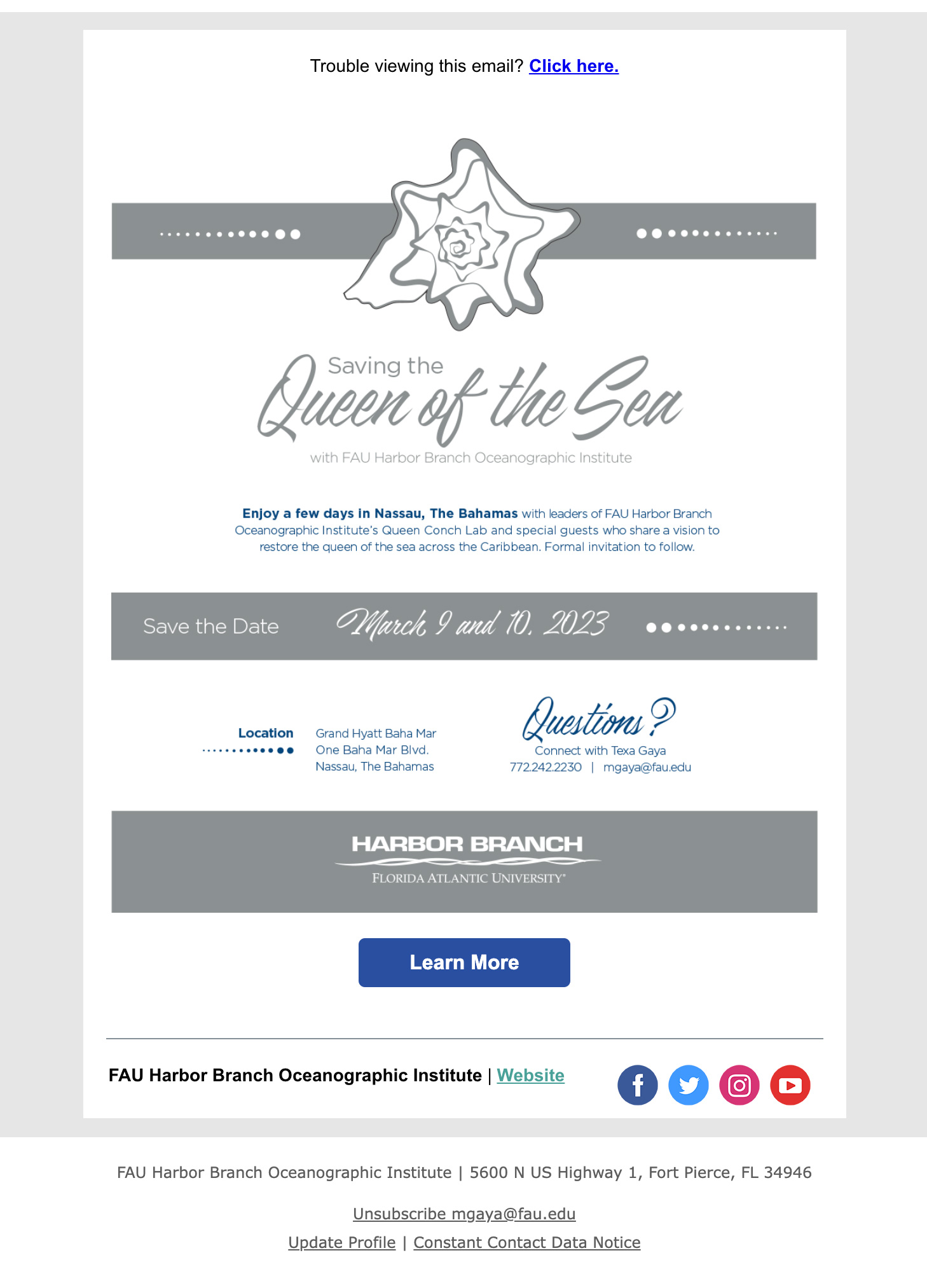
I am designing and inline coding the emails, ensuring their compatibility with most email clients while also allowing me to reconnect with the almost pre-historical technique of inline coding. The email below is one of the recent ones I created for our College of Engineering. The first one is the actual email, included here with the coding behind it, while the following ones are images to give you an impression of how they look in the mailbox. ↓
|
In email coding, using oldest tags like <center>, <i> or using the <table> tag as a container vividly remind me of the times when I first started coding in 1998. Back then, all HTML coding was inline, so working on emails feels like a time machine, taking me back to the early days of web development for a few hours. It’s a nostalgic yet practical approach that helps me appreciate how far design and coding have come. Sometimes, revisiting these techniques brings fresh perspectives to my work today.

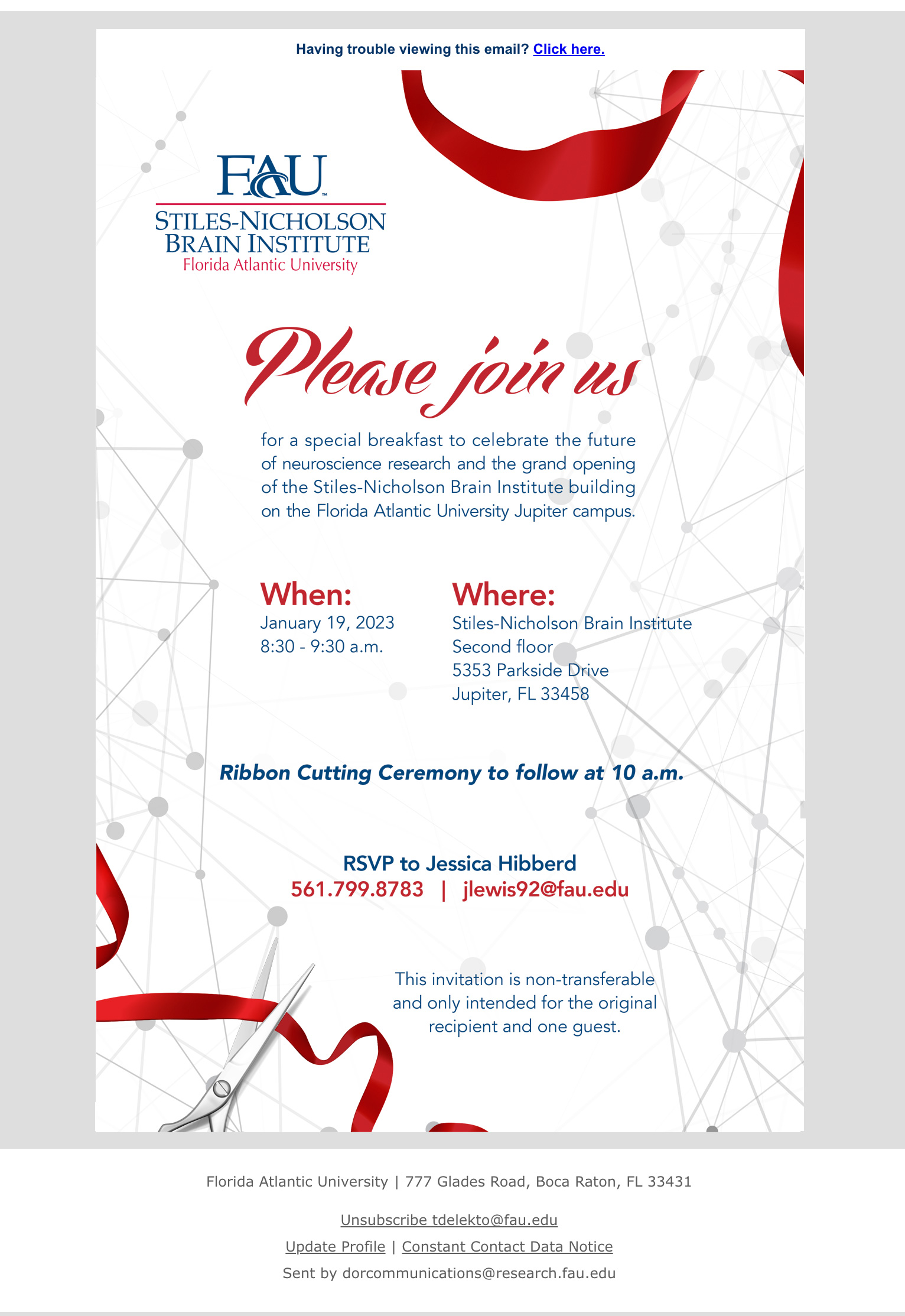
↑ The emails above announce the ribbon-cutting ceremony for Florida Atlantic University's newest building on the Jupiter campus. By prioritizing accessibility and visual consistency, these emails are designed to effectively convey the excitement and significance of this milestone event to all recipients, regardless of their device or email platform.
In-line coding for the emails is preferred because many email providers are slow to update their preview capabilities to support the latest web technologies. In-line coding avoids reliance on external style sheets and often employs table-based layouts, reminiscent of practices from decades ago. Despite these traditional elements, modern email technologies now offer far more opportunities for creative and eye-catching styling, promising richer and more engaging email experiences than ever before.